Why The Gold/Silver Ratio Is A Useful Indicator
The comments below are an edited and abridged synopsis of an article by John Rubino
Some view the original gold/silver ratio of 15 as a number pulled out of thin air; others say that gold is a purely monetary metal and silver is part industrial, part monetary. They conclude that comparing the two is not an indicator of future prices.
Both points are irrelevant. The reason the gold/silver ratio has fluctuated within a broad but well-defined range is that humans have a vivid visual imagination.
Early in a precious metals bull market, people are skeptical of the need for safe-haven assets, so the money that flows into the sector goes mostly to the big-name, super-safe choice, which is gold. Gold goes up relative to silver, and the gold/silver ratio expands.
Gold keeps rising and new money—much of it attracted by gold’s newfound price momentum rather than an understanding of the nature of money—flows in, pushing gold even higher.
The early gold investors register big gains and are more willing to take on extra risk in return for potentially larger gains. They see silver, the other monetary metal, languishing at a relatively low price.
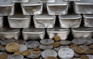
But try thinking in images: Picture a single 1-ounce gold coin and consider what it would cost. At gold’s new, higher price, this seems like a lot of money for such a small thing. Next, consider the silver price and how many 1-ounce coins you can buy for the price of an ounce of gold.
Suddenly, silver looks extremely cheap. For the price of one ounce of gold, you can get two handfuls of silver.
In a bad situation, silver coins are more useful than gold, because their price allows them to function as $20 bills rather than gold’s $1,000+. You can buy groceries and bullets with silver coins.
Suddenly aware of silver’s advantages, investors conclude that it is the precious metal to load up on.
Adjust this for the global pandemic’s distortion of most markets and convert it into a chart (shown), and you get the past two months’ gold/silver ratio, which depicts a bout of panic followed by a trend back towards traditional norms.