S&P 500 Bubble Symmetry | Chart of the Week
This chart is based on the article by Charles Hugh Smith: What Goes Up Also Comes Down: The Heavy Hand Of Bubble Symmetry
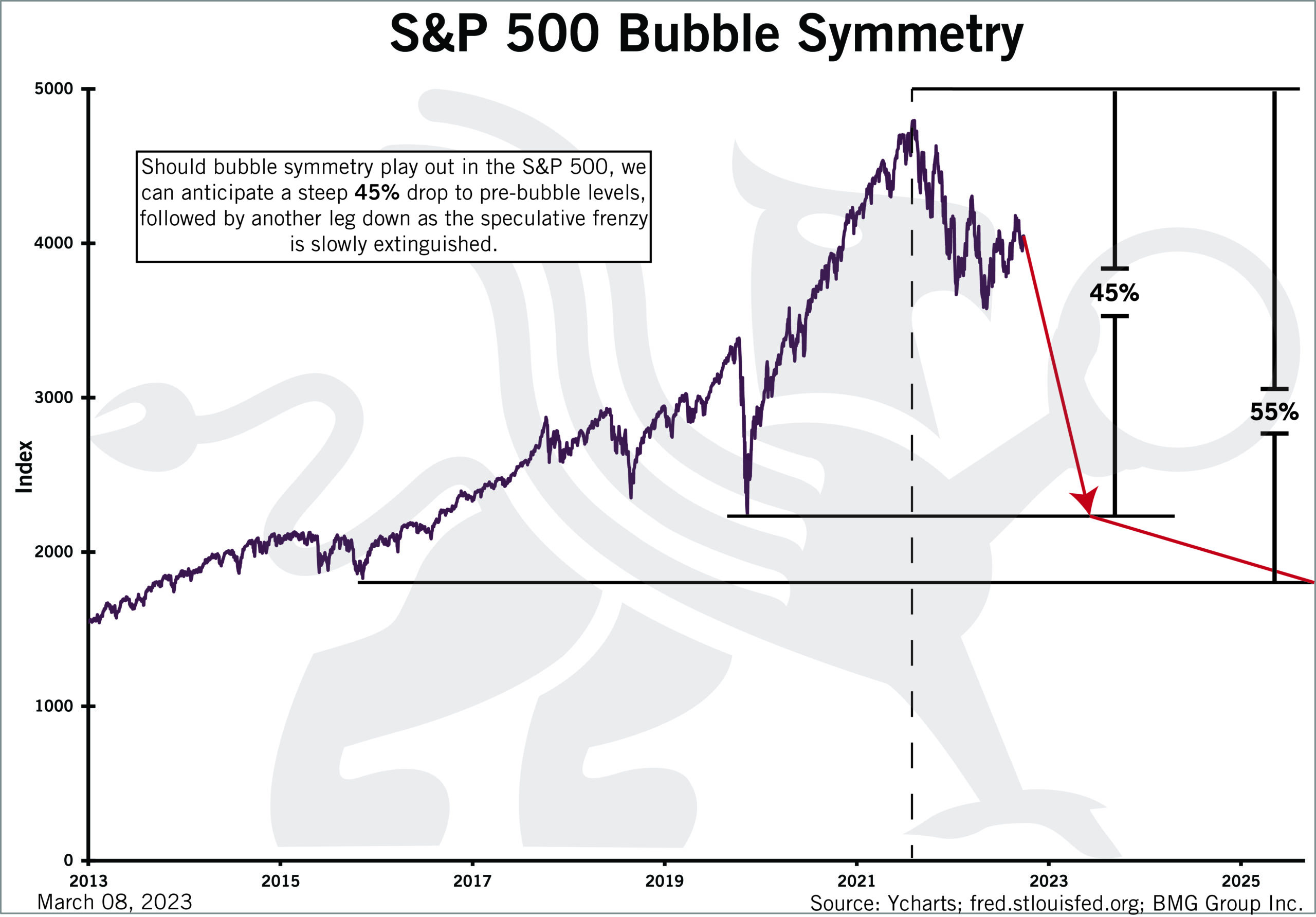
Bubble symmetry is, well, interesting. The dot-com stock market bubble circa 1995-2003 offers a classic example of bubble symmetry, though there are many others as well. The key feature of bubble symmetry is the entire bubble retraces in roughly the same time frame as it took to soar to absurd heights.
Nobody could see bubble symmetry coming, of course. At the peak and for some time after, bubbles are viewed as the natural order of markets and so they should continue expanding forever.
Alas, the natural order of markets is mean reversion and the collapse of whatever is unsustainable. This includes speculative manias, credit bubbles, asset bubbles and projections of endless expansion of margins, profits, sales, consumption, tax revenues and everything else under the sun.
There’s a well-worn psychological path in the collapse of bubbles. This path more or less tracks the Kubler-Ross phases of denial, anger, bargaining, depression and acceptance, though the momentum of speculative frenzy demands extended displays of hubris and over-confidence, i.e., the first wobble “must be the bottom.”
There’s also repeated spikes of false hope that “the bottom is in” and the bubble is starting to reflate.
This pattern repeats until the speculative fever finally breaks and all those betting on a resumption of the bubble mania finally give up.
Sources: Ycharts; fred.stlouisfed.org; BMG Group Inc.